This season’s coolest color combo is a trio of elementary school classics.
Don’t let their simplicity fool you: Though they’re the most basic shades on the color wheel, primary hues can be used to surprisingly sophisticated effect. “Primary colors come with a sense of purity, simplicity and enthusiasm,” says professional color consultant Amy Wax. “The appeal lies in their youthful energy.” The role of these bold hues in design is a complicated one. While red, blue and yellow are the source of all other colors (black and white are used to create tone and value), their subdued secondary derivatives are arguably more popular in interiors. “The trick is finding a balance,” says Wax. “When paired with understated hues, primary-colored accents can elevate and energize a palette. They’re the sense of humor, and they’re honest and forthcoming.”
The significance of primary colors has long been explored by art and design theorists, most notably those from the Bauhaus school. Founded in 1919 by architect Walter Gropius, the movement emerged from war-torn Germany with a mission to unite the art world—and society—through a universal creative expression. “They were seeking to define modernity by stripping things down to basic colors and shapes,” explains design historian Alexa Griffith Winton, manager of content and curriculum at Cooper Hewitt, Smithsonian Design Museum. “Europeans witnessed so much death and destruction during World War I; the Bauhaus proposed the idea that in its purest form, art can unify and, ultimately, heal the world.”
At the school, courses on the primary colors were required and were taught by esteemed artists like Josef Albers, Wassily Kandinsky and Paul Klee. “Kandinsky believed color and emotion were linked,” says Winton. “He’d give his students a diagram of a circle, square and triangle, and ask them to assign a primary color to each to demonstrate how we instinctively associate certain colors with shapes.” The artist perceived circles as blue, squares as red and triangles as yellow—a sentiment that’s showcased in an array of iconic Bauhaus works, including Peter Keler’s Cradle and Herbert Bayer’s 1923 wall-painting study for the stairwell of the school’s main building in Weimar. “The foundational emphasis on primary colors at the Bauhaus is still widely used in present-day art school curriculums,” says Winton. “The idea that art and design can heal the world might seem outdated, but the belief that even the most basic shapes and colors are fundamental to design and that the most humble, everyday objects deserve to be well-designed lives on.”
The notion that primary colors evoke certain emotions also remains popular today. At a pseudo- scientific level, the field of chromotherapy purports that exposure to red, yellow and blue light can reduce everything from headaches and muscle soreness to stress levels, while interior color consultants agree that at the very least, employing these hues in a room can boost your mood. “Not only do primary colors visually brighten up a space, but they also offer a feel-good element that can also help spark creativity,” says Wax.
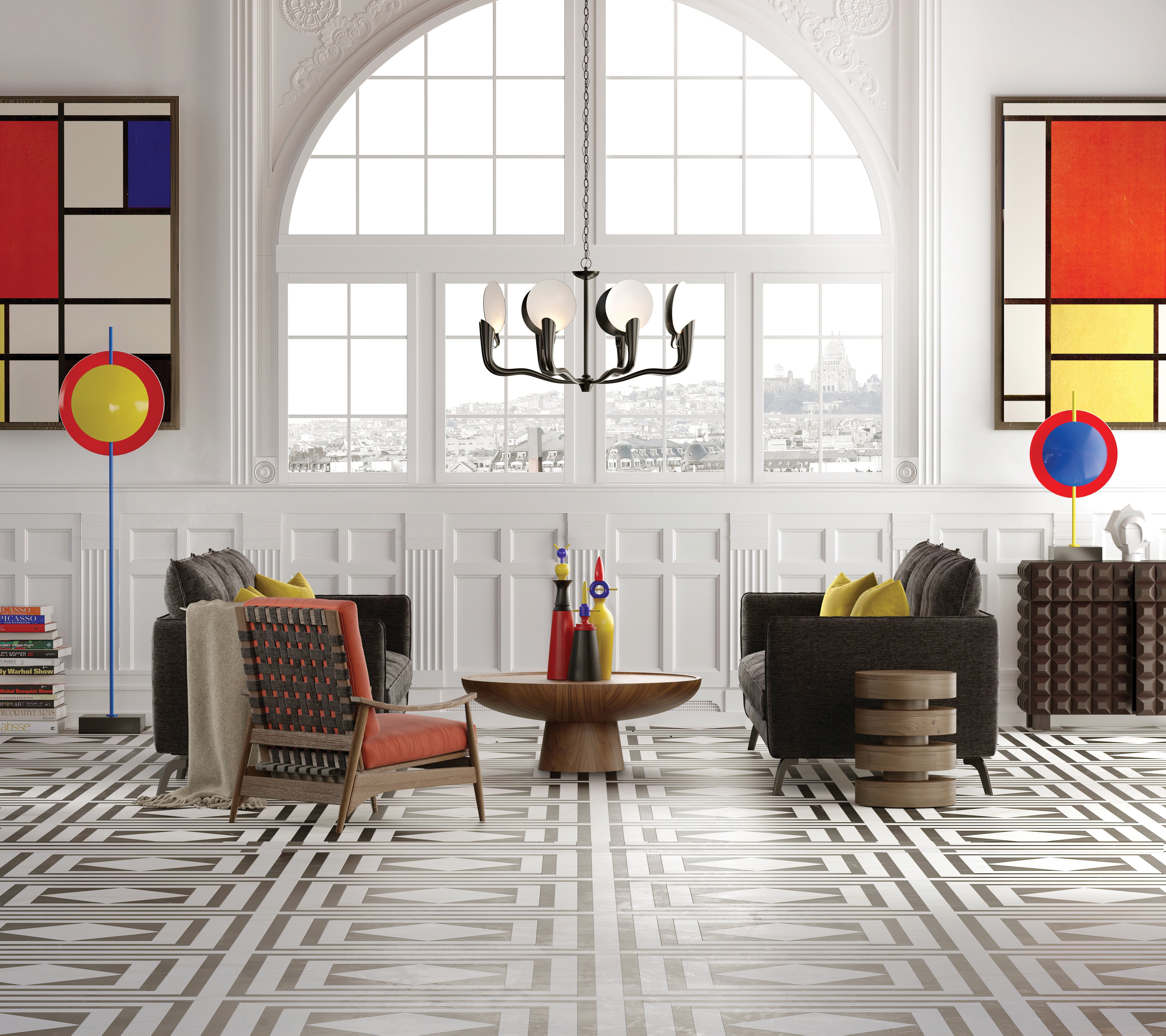
Regardless of their appeal, integrating the three hues into a room isn’t always easy. “My rule of thumb is to use them as accents—on chairs, cabinets, side tables, pillows and accessories like vases and objets d’art,” says North Bethesda, Maryland–based designer Lorna Gross. “They bring a certain energy and vibrancy to a space; the key is deter- mining the appropriate dose and proportion.”
Gross, who regularly employs primary hues in her projects, says another trick to decorating with bold colors is incorporating them in groups, which keeps a splashy shade from looking out of place. “The most ideal result occurs when the color is repeated at least three times, such as two chairs and a vase or artwork,” she explains. “They can be toned down with softer, muted hues for a more sophisticated feel, or mixed with neutrals and metallics for an ultraluxe look.”
Whether you’re a fan of the Bauhaus movement or simply looking to brighten up a neutral room with the zip of a striking blue (or red, or yellow), one thing all design lovers can agree on is that primary-colored pieces invigorate an interior. “Primary colors are so spirited,” says Gross. “They immediately lift the energy level.”
Homepage photography: Currey & Company channeled the primary colored artwork of Piet Mondrian for its Mister M collection. | Courtesy of Currey and Company


