It’s easy to step into a well-designed space and know it works. It’s often harder
to describe why, exactly. In a new column, BOH puts design pros to task dissecting the successes of a specific space.
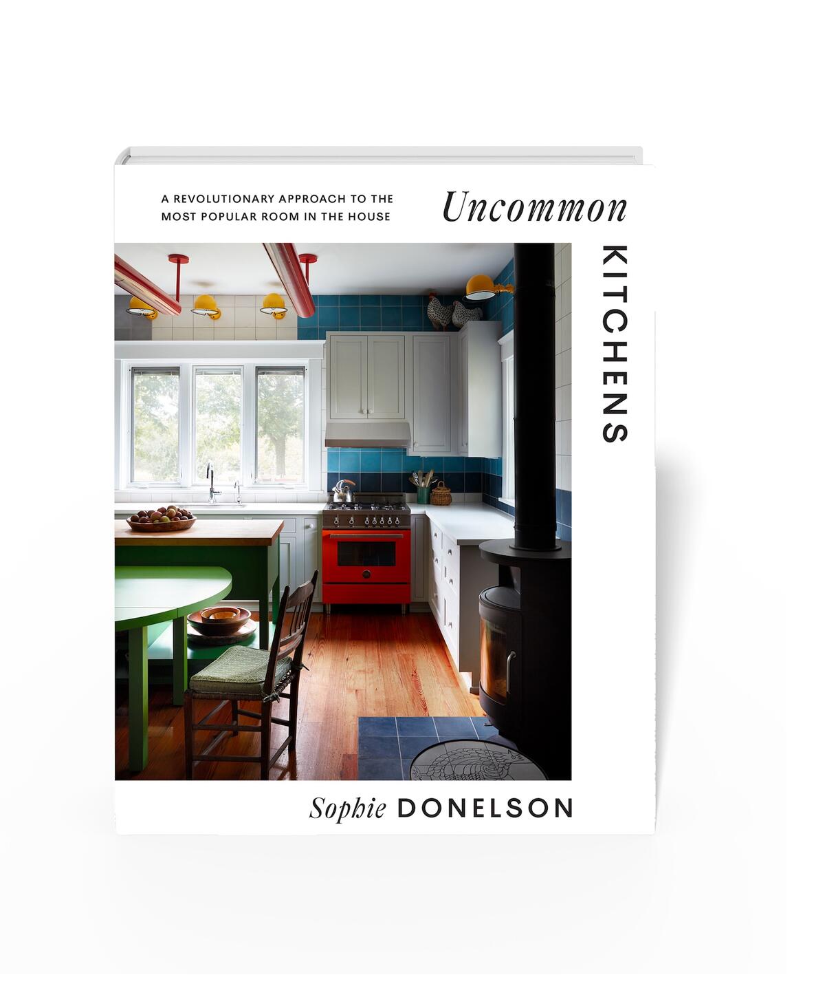
In her new book, Uncommon Kitchens, design journalist Sophie Donelson sought out spaces designed for living in, not just looking at. “I’m making a big case for the idea that kitchens can be more creative, more iterative and more flexible than we’ve been treating them,” she says. “We think about the kitchen as requiring expensive and onerous decisions—new finishes, countertops, cabinetry and appliances—so there’s a feeling that these are purchases that we make once and live with. For that reason, a lot of people are intimidated by making big, bold choices.”
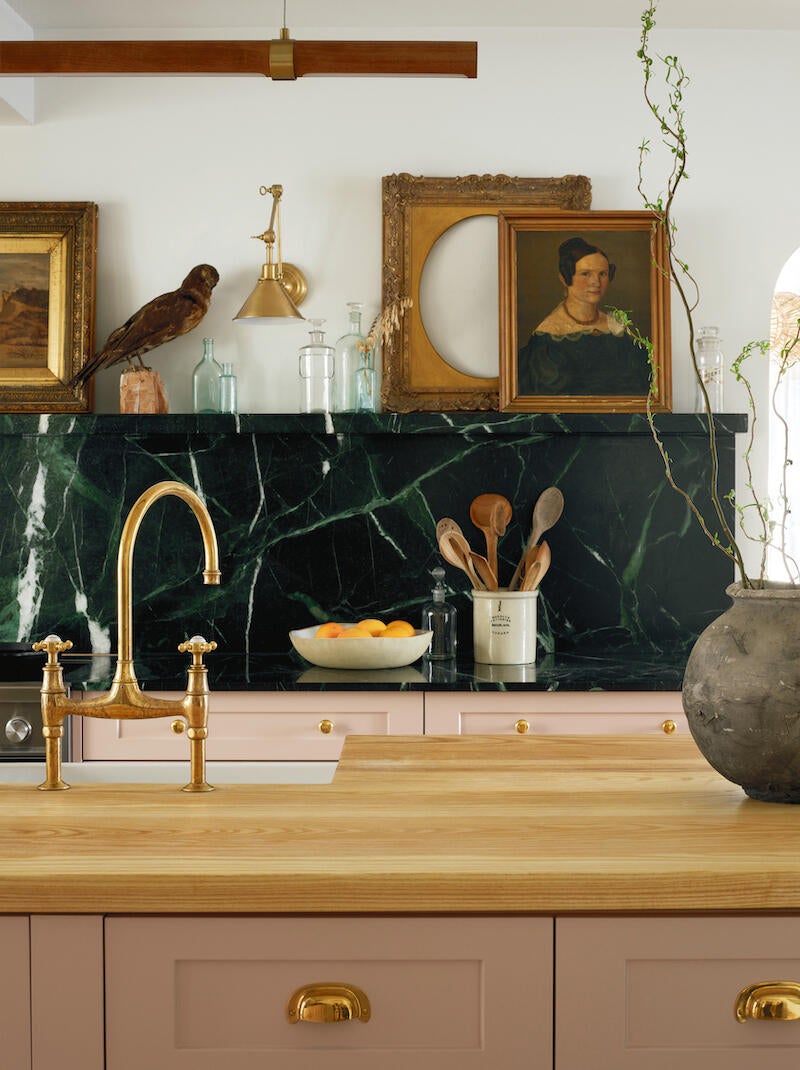
Among the 27 projects featured in the book is the 1920s farmhouse of antique-collecting photographer Christine Flynn in Ontario, Canada. Located in an agricultural hamlet dappled with weekend retreats, the quaint cottage’s kitchen bucks tradition with soft salmon-hued cabinetry, richly grained green marble and layered vintage treasures. “This kitchen shows that there are ways to make smart choices that have longevity and lasting appeal but also leave a ton of room for changing the kitchen, updating it and reviving it to feel fresh and new,” says Donelson. “In other rooms of the house, like a living room or a bedroom, you can make small choices that have a big impact, like swapping the blankets or the pillow or the comforter, and we know how to do that all over the house. But in the kitchen, people just don’t think that way. The point of this book and this image in particular, is to show that it is actually possible.”
What makes the room work? We called Donelson to find out.
CREATE INTIMACY IN CLOSE QUARTERS
The ceilings are quite low—barely nine feet—which some people would consider a real detriment because you have less light coming in. What this kitchen does well is [create an] incredible sense of intimacy. I often say that we are “loving our kitchens to death” because we just make them bigger and bigger, but not overworking them can create more of an emotional connection. The owner did not have upper cabinets—something we see in a lot of British “un-kitchens,” which contain space for cooking and food prep but break the traditional mold of the American kitchen—and that is really to keep the sightlines clear. There’s nothing blocking the doorway, and by keeping it clear, you don’t have that feeling of claustrophobia.
DISCOVER THE PERKS OF A NONTRADITIONAL PALETTE
There are a couple of things in this kitchen that have permanent and lasting appeal, and a lot of items that can be removed or changed when styling. This is a great blush-colored paint, Cashmere by Benjamin Moore, that the homeowner had used before in bedrooms and bathrooms, and always just loved the way it appeared. The lesson is that colors don’t necessarily have to be just “kitchen colors” or “bedroom colors”—if you like the way that it makes you feel, go with it. You’re welcome to bring that anywhere. As we know, wood cabinets can be repainted, so if this blush pink ever doesn’t feel like the right color, it can be changed. People often choose a color scheme that feels safe or easy, but there is a lot to be said about painting with colors that are not always obvious. There’s an energy that’s created by choosing this deeper green and this blush pink—it feels really original.
RETHINK STANDARD STORAGE OPTIONS
On the far side of the room, there is a vintage display and glass hutch that is used for the serveware, plates and dishes. The glass allows light to travel through, and it’s a freestanding piece of furniture—just the way that cabinets used to be before we all had built-ins. Storage doesn’t always have to involve some kind of cabinetry scheme—you can also incorporate a vintage piece of furniture. This is one of the first decisions the owners made for the kitchen. They picked a spot and designed from there.
CULTIVATE A LAYOUT FIT FOR A CHEF
The space is pretty petite, and the island is quite large. The reason that makes sense is that the corridor between the stove, the sink and the dishwasher—which is also in the island and the prep space—is quite narrow. This is exactly what you want when you’re a chef: to be able to pivot from one counter to another. The more space that people add, the less efficient the kitchen is. What we want this single galley where you can literally rotate your body from the range over to the sink without taking steps.
SHOWCASE YOUR COLLECTIONS
The marble is called Verias Green. It appears black in some light and that beautiful, deep jade green in other light. It has this real interest and special quality because it isn’t just a black or a creamy white, and there’s natural veining in this stone. It’s used as a counter, backsplash, and then smartly as a ledge, which creates an opportunity for collections, styling and all that breathing room up there. If you were to take all of the art, (flowers and collectibles on that ledge, you would be left with something that’s very streamlined and quite minimalist, and you could live like that. But when you want to style or arrange, you have this natural place to do it, and it’s like a mantle. It feels quite inviting to add collections.
LET HAPPY SURPRISES HAPPEN
The homeowner did not go into this project looking for a green marble. She was going to use Calacatta marble, which is creamy white, and it usually has these little bits of brown and gold. It’s a very specific look that’s quite timeless, but the right slab just didn’t turnup. That decision to go green was made because she had the (flexibility to say, “This isn’t what I expected, but I don’t want it to ruin my timeline. I’m not going to obsess over this—how do we make this work?” I find that the tighter and more obsessive people go toward one vision, you can feel it in the space: It’s stiff and unwelcoming. Great designers, architects and stylists can really shine and get it right when everything possible is available, but getting it right when the options are limited is something I love to see. It’s also a way to clarify the design process—more choices aren’t always better.
Homepage image: The Verias Green marble backsplash and ledge was a last-minute find for the renovation of this 1920s farmhouse in Prince Edward County, Ontario | Patrick Biller


